🔥 Up to 72% OFF - Access all current & future templates with a one-time payment. Lifetime now at $249!





Posted on
July 18, 2026
| By Qourvac
Type systems for editorial web experiences
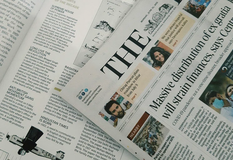
How mixing display serifs with workhorse sans-serifs creates high-contrast visual hierarchy that elevates modern web UI

2.4K
418 comments
Type systems for editorial web experiences
Typography is the foundation of every editorial experience. More than simply displaying text, a well-crafted type system creates rhythm, establishes hierarchy, and improves readability across every screen size. When typography is consistent and intentional, readers can focus on the content instead of struggling with the interface.
Modern editorial websites rely on flexible type systems that adapt seamlessly across devices. From headlines to captions, every text style should contribute to a unified visual language while supporting accessibility and performance.

Building a scalable type system
A scalable type system begins with a limited set of carefully defined text styles. Instead of creating unique font sizes for every section, designers establish reusable heading, paragraph, caption, and label styles that remain consistent across the entire website.
Using consistent spacing, line height, and font weights ensures every page feels connected while making future design updates easier to maintain.
Essential principles for editorial typography
Well-designed editorial interfaces prioritize readability above everything else. Every decision should support comfortable reading across desktops, tablets, and mobile devices.
- Create a clear hierarchy with consistent heading levels.
- Maintain generous spacing between paragraphs and sections.
- Limit the number of font families used throughout the website.
- Optimize line length for comfortable reading.
- Use responsive typography that scales across all devices.
- Keep contrast high to improve accessibility and legibility.
Today's editorial websites combine clean typography with thoughtful spacing, subtle motion, and responsive layouts. Rather than relying on decorative effects, premium experiences focus on clarity and usability while allowing the content to remain the primary focus.