🔥 Up to 72% OFF - Access all current & future templates with a one-time payment. Lifetime now at $249!



Posted on
May 17, 2026
| By Qourvac
Designing cms-driven marketing sites that convert
How to architect Webflow collections, slugs, dynamic reference fields, and scalable CMS structures for enterprise-level web projects

1.9K
536 Comments
Why composition still wins for premium brands
Premium design begins long before colors, effects, or interactions are applied. It starts with composition the invisible framework that determines how information is arranged, prioritized, and consumed.
The strongest templates create a sense of order. Every section has room to breathe, every headline serves a purpose, and every visual element contributes to a larger narrative. Rather than competing for attention, the components work together to create rhythm and flow.
Many templates attempt to impress through density, adding more features, more animations, and more visual treatments. The result is often a cluttered experience that feels busy rather than valuable. Premium templates take the opposite approach. They remove unnecessary complexity and focus on clarity.

The rise of contemporary editorial typography
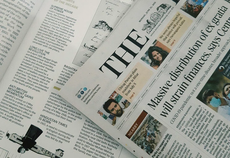
One of the most noticeable shifts in modern template design is the growing influence of editorial layouts. Rather than relying exclusively on geometric sans-serif fonts, many premium templates now combine expressive serif headlines with highly readable sans-serif body text. This pairing introduces personality and sophistication without sacrificing usability.
Typography is no longer treated as a decorative layer added after the layout is complete. It has become a core design tool used to establish hierarchy, pacing, and visual identity. The result is an experience that feels closer to a premium publication than a traditional marketing website.
The principles behind premium digital experiences
- White space improves clarity, focus, readability, and balance.
- Intentional spacing helps content breathe and feel premium.
- Strong visual rhythm creates organized, trustworthy user experiences.
- Simplicity and clarity build confidence without overwhelming visitors.
- Consistent design decisions naturally strengthen trust and usability.
When spacing, rhythm, and clarity work together, great design becomes effortless to trust and impossible to ignore, especially across digital products where users expect intuitive flow emotional resonance and consistent visual hierarchy everywhere.